Sunday, 1 February 2015

Bibliography

Websites:

Ernst Haeckle Images – http://biolib.mpipz.mpg.de/haeckel/kunstformen/natur.html   (15.06.14)

May Van Millingen – http://mayvanmillingen.com/   (10.10.14)

Anna Sebestova  – http://cargocollective.com/annasebestova  (23.06.14)

Melissa Bolger - http://www.melissabolger.com/  (01.09.14)

Chad Wasser - http://www.chadwasser.com/ (08.09.14)

Yellena James - http://yellena.com/ (22.09.14)

Laura Bell - http://www.laurabellstudio.com/ (06.10.14)

Karen Margolis - http://karenmargolisart.com/Karen/Intro.html (20.10.14)

Crystal Wagner - http://www.crystalwagner.com/ (08.09.14)

Klari Reis - http://www.klarireis.com/ (19.12.14)

Alan Bur Johnson - http://www.alanburjohnson.com/ (07.01.15)


Evaluation

My final piece is an installation of Petri-dishes that shows an abstract illustration of bacteria through different layers. The bacteria is not just growing in one dish like in a science experiment but has grown across all the dishes in the installation and even outside of them.
I used actual, scientific Petri-dishes which were made of a thin but solid clear plastic, the use of these in the artwork was inspired by artist Klari Reis but I also wanted to use them to emphasise the fact that the illustration inside them was of bacteria.

I had created the illustration of bacteria by splatting various coloured inks onto a sheet of card before drawing into with fine liners. The colours of inks I used were based upon a certain work of Reis's that I had really liked the colour scheme of. My drawing style had been developed in this project by the influences of other artists I researched. Melissa Bolger's was the first artist I looked at who had combined splats of colour with line drawing and Chad Wasser used a similar method. In the illustration I used for my final piece, the shapes and decorative techniques mostly came from research into Crystal Wagner but I needed to have studied the other artists in order to understand how to combine the style with the ink. Alan Bur Johnson's work inspired me to overlap the dishes as he does that with his own transparent circle installations.

An alternative way to which I could have put my design on to acetate would have been to work straight onto it with the inks and pen drawing. I had experimented with this and found that the inks looked very effective and more liquid like. The issue was that when it came to drawing into the ink splats, I found it difficult to be as detailed and definite as it would have been drawing it straight onto paper. In a similar way I could have worked straight on top of the PVA glue with pen but I would have had the same problem.

One improvement I would have made to the final piece would have been to make the ink splats in the PVA glue in the dishes more spread out with lighter colours. Some parts are just thick clumps of the ink and this didn't look right when it dried. I am really quite happy with how it came together. The idea of the work is quite complex and it holds many different layers of ink and drawings which I aimed to make connected with each other. I think that because I kept the installation quite neat and precise in various aspects of it, it made it seem quite clear and more understandable. There is still a lot of room for experimentation with this method I used to produce it, I feel like I found a good medium between complexity and simpleness.
For me, the most successful part in this project was the development of my drawings, I think using the styles of artists Chad Wasser and Crystal Wagner came natural to me and I really quite enjoyed developing the styles so that they were more my own and by combining them. I did also like the work I did with May Van Millingen although this was very different to the rest of the project, I was happy with the outcomes I had produced by digitally applying colour to the fine liner drawings.

If I had more time, I would have liked to have researched more into actual bacteria or viruses. This would have allowed me to make illustrations that were still abstract but were more related to the biological matter. I could have added a deeper meaning to my outcome if it was based upon a specific type of virus.

Because 'Biomorphic Forms' covered such a huge range of topics, I would have liked to have narrowed it down to a more refined category at the start of the project if I were to do it again. I looked at floral based artist Yellena James and the mushroom studies of Anna Sebestova when these hardly related to the bacteria I had based my final piece upon. It wasn't that I didn't like my work that was inspired by them, just that it didn't aid me in producing my final outcome.

Final Piece

I now looked back again at putting my ink and pen illustrations or 'bacteria' into actual Petri-dishes. My method of doing this was to print out one of my illustrations large onto a sheet of acetate. I then out a circle of it to put into a dish.


I liked this as the transparent acetate the drawing was printed on made it look like it was connected to the dish as they were both transparent. This meant that anything underneath the dish could be seen which made me think about putting the cut out circle on to of a layer of PVA glue with ink splats in it, like I had done in my research of Klari Reis. 


This gave the dish another element and stopped it from looking flat. The PVA dried so it was still transparent. I therefore decided the my final piece should be based upon this method.
I now had to come up with a final design of the illustration I would use. I decided to use one of my previous drawings. This was perhaps my favourite one from the whole project and I had used this in one of my pin illustrations.


 My final piece would be made using Alan Bur Johnston's technique of overlapping circles but the circles would be Petri-dishes. I would cut this image up into circles to fit in the dishes before laying them out into a 3D work. I worked out a rough layout of them on top of the acetate illustration before cutting.


After I had poured PVA glue into each dish, I splatted colours of ink into them according to what part of the illustration would be in that dish.

Once I was happy that each Petri in the artwork roughly represented the colours of the illustration, I cut up the acetate illustration into the circles. In order to achieve the overlapping effect of Alan Bur Johnson, I had to print the design onto two sheets of acetate so there was enough to fill each dish. 
I only had to place the cut out circles of acetate onto the top of the PVA glue in the dish and they stuck. I put them back into a cluster of how it would look like when it was finished. 

I next had to stick the base layer of them down onto the backing sheet of card. I also wanted to add something more to the whole cluster of them and so I cut out shapes of my illustration from the rest of the acetate and placed them around the base layer of dishes. In some places the shapes were in the correct position and fitted between the dishes but I also added shapes to other parts of the piece and they still fitted in because of the similar lines and colours.


I now had to add the next layer. I wanted to raise it higher than the first and so I attached the Petri-dishes to small, clear plastic tubes, 3cm high. I glue gunned the rims of the tubes to the bases of the dishes and also to the backing card. The top layer of just one dish was attached to a 6cm tube and this acted as the peak of the Petri-dish cluster. 


Development of Ideas

Because I thought my drawings could be representative of viruses/bacteria, I wanted to look more into the science of them. Biologists cultivate bacteria by putting it into a Petri-dish and letting it grow. I decided to try and represent bacteria in a Petri-dish with my drawings. From looking at some examples of bacteria, I splatted inks onto a page and worked onto it with fine liner. I then divided this into different circles as if they were dishes.
I now looked at Petri-dish artist Klari Reis. Reis has produced as collection of Petri-dishes by adding pigments and dies to a special plastic. These turned out to be very bright and abstract, not necessarily representing bacteria. I experimented and attempted to use a similar method to produce my own Petri-dishes. I purchased some empty, plastic Petri-dishes and then added P.V.A glue to them. I next spatted them with some ink to add colour.


These then dried clear so you could still see the colour but also through the dish. I think this method has penitential but to improve my outcomes I would have had to splat the ink so that it wasn't in just one thick clump as this was too dark and did not dry very well.

Part of Klari Reis's work is how she lays out the finished Petri-dishes. She often makes them in to circle shapes, almost like one big Petri-dish. I think that this layout can be effective but it's all on one level and she does not expand on the 3D element of her work.
However, artist Alan Bur Johnson's installations are so effective because of how he uses multi-layers and overlapping. Johnson's work is based upon a range of biological sources such as trees or insects. He turns abstract, black & white photographs into lots of small circles which he arranges in a certain way, relating to swarms of insects or other biological matter.


I wanted to create a similar work, instead of using a photograph, I used one of my Crystal Wagner inspired drawings as this was actually based upon biomorphic imagery. I scanned in this work then printed it onto a sheet of transparent acetate. I cut this into lots of small circles before pinning them into a square shape of foam-ex. I cut the pins to different lengths so the circles were at a variety of heights. I liked this outcome. I think the most effective part of it was that some circles over lapped and this meant the shape of the original drawing was changed.


Next I created three more pin installations. This time, however, I spatted ink onto a sheet of paper before cutting it up. The benefit of this was that I could use a special hole punch to cut out the circles, about 2cm in diameter. I stuck the circles to the various sized pins with a glue gun the pushed them into foam-ex so they were in a tight cluster with the highest circles being in the middle. These tended to be the more interesting cut outs of the ink work.


On two of these installations I had started off by drawing onto of the ink work before I cut it into the circles. I think this worked well and was happy with each outcome.

Merging Inspirations


Next I thought I could merge the drawing style of Crystal Wagner with the ink illustrations of Melissa Bolger and Chad Wasser. I could work with the ink splat so that the drawing connected and related to it like I'd done with the previous artists. As this was my first attempt at this illustration technique, I am really pleased with the drawing. I think the contrast between the strange patterns I'd drawn in fine liner contrast very effectively with the vivid ink colours.


I next carried on to create and another work by splatting ink onto the page before going over it in that Crystal Wagner inspired style. This time, however, I work to a large scale. I also added the drawing styles of other artists I had researched, Melissa Bolger's abstractly formed shapes and Laura Bell's dripping circles. I think that Bolger's style worked effectively with Wagner's but Laura Bell's dripping effect did not seem to fit in with this illustration, it seemed to work better with inks and also I didn't feel so confident in drawing that way. I added some extra layers to this work to give it a 3D effect.

Overall, this combination of vibrant ink spats with line drawings was something I felt held a lot of potential development and it was something I wanted to work on in this project. Melissa Bolger stated that her in her works, the bright inks represents a disease effecting the drawing which is why in places, the inks seems on top of the pen work. I liked this idea and it seemed to me that this style of illustration could relate to diseases and viruses.

Monday, 19 January 2015

Abstract Paper-cut Illustration

Knowing that I enjoy working with a more abstract quality to my work, I started to think about linear illustration of biomorphic shapes. I came across the work of Crystal Wagner.

Crystal Wagner

Crystal Wagner's art is mostly influenced by nature, particularly the shapes found in trees and flora. I looked into some of her black & white, bold, exiting drawings. She states that to come up with these abstract works she focuses on drawing a biomorphic influenced shape before spreading outwards and letting herself become more creative for the rest of the piece.


I decided to look closely at her illustrations and came up with my own in her style. This helped me to understand some of the marks she uses in her works so that I could create my own.

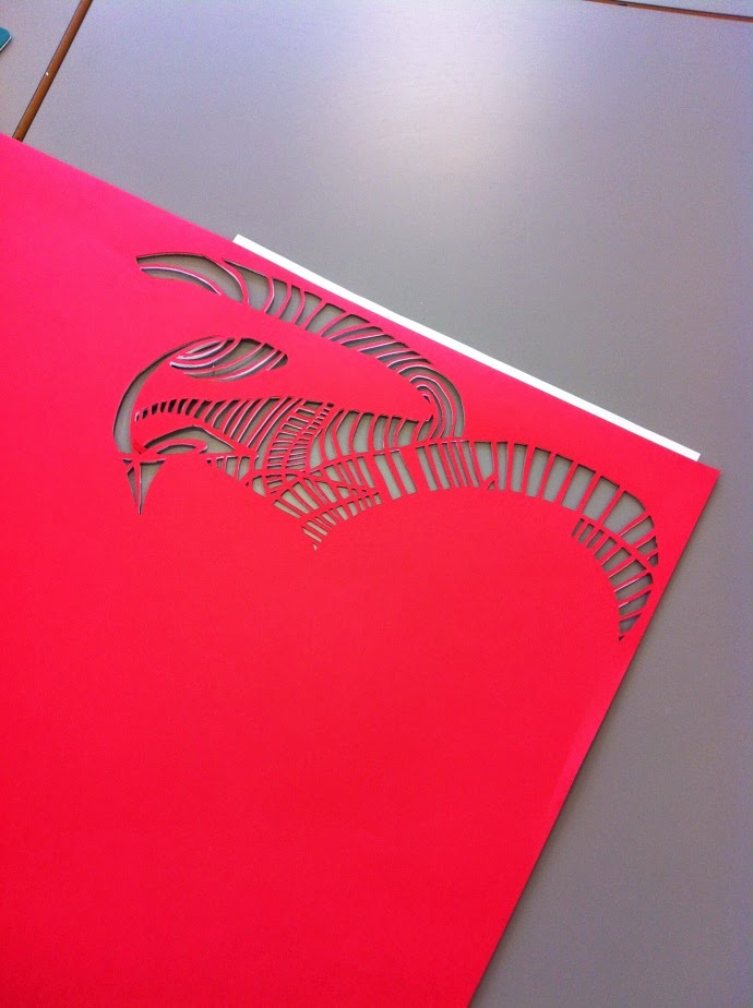
I thought that because she has created these illustrations in only two tones, they could be easily converted into paper-cuts. In order to show the amount of detail in the drawing, I would have to paper-cut it to a large scale. I used an A1 sized sheet of red card and based my paper-cut on this drawing by Wagner.


 I wasn't too strict in some places of the paper-cut and so it isn't an exact copy of the work but it had to be adapted in order for it to stay together. This work took me a long time but I think her style in this medium would have to be done to a large scale in order for it to be effective.